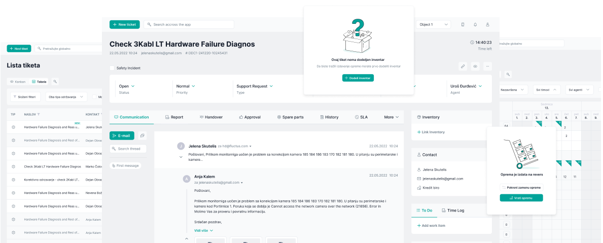
Fluctus Help Desk
A ticketing system built for a data center managing a large volume of equipment across multiple technical teams. The platform supports both scheduled maintenance and urgent issue resolution. Its flexibility makes it suitable for any organization with a complex equipment infrastructure.

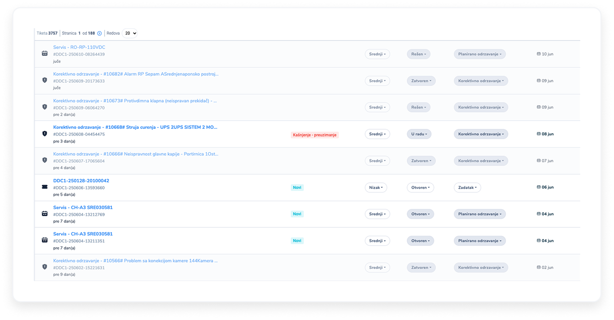
Confusing ticket priorities in the list
There was no way for a user to clearly distinguish which tickets should be his first priority based on the multiple factors determining urgency.
Analyzing factors that define urgency
I analyzed all the factors that define a ticket's urgency — such as status, time sensitivity, and agent’s ability to act.
I then explored how to reflect those visually within the list. The goal was to reduce cognitive effort by allowing users to instantly recognize which items required immediate attention and which ones were currently out of their hands.
Active & passive ticket states
Some tickets require immediate action, while others are temporarily blocked by external dependencies such as waiting for a client response.
To help users focus on actionable and urgent tasks, two ticket states were introduced.
Active: Agent hasn’t yet responded to the client
Passive: Agent is waiting for the client to respond and clarify problem and tickets that are complete
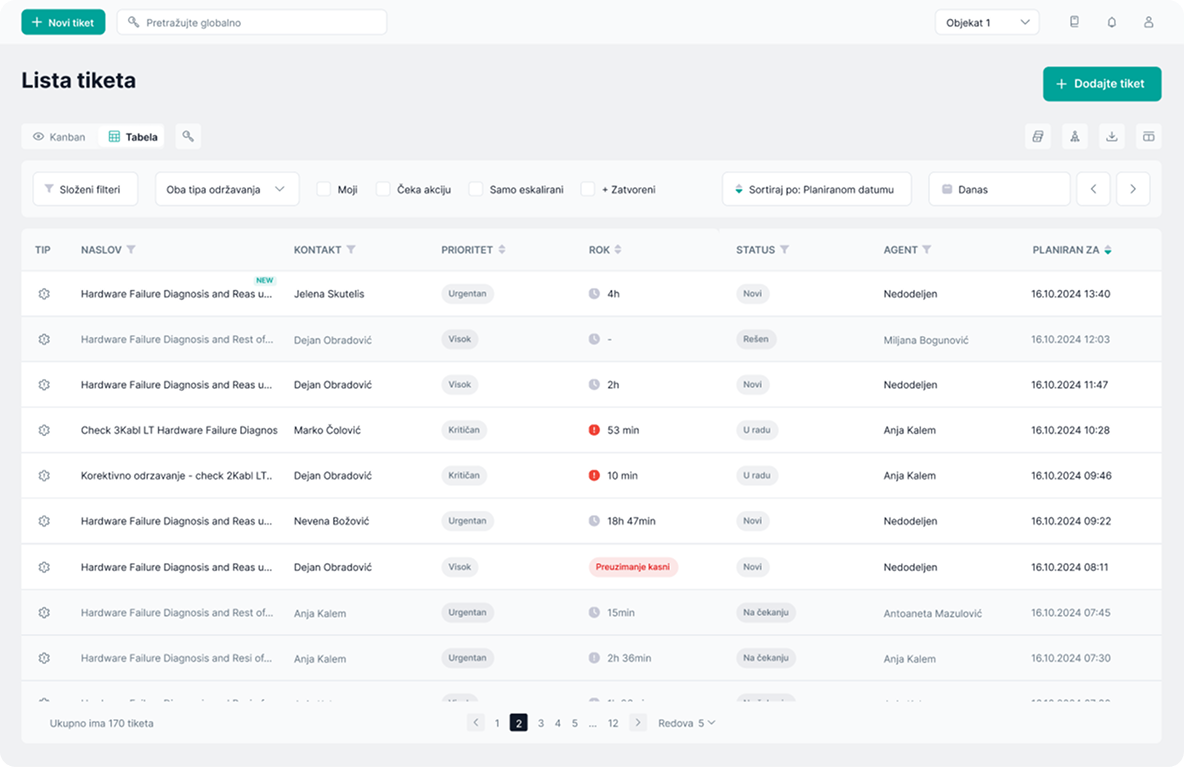
Timer instead of timestamps
Instead of displaying multiple parallel deadlines, I unified ticket urgency into a single visible due time.
This reduced visual clutter and made urgency significantly easier to scan in high-volume workflows.
Ticket timers pause while waiting for client responses, preventing blocked tickets from appearing urgent.
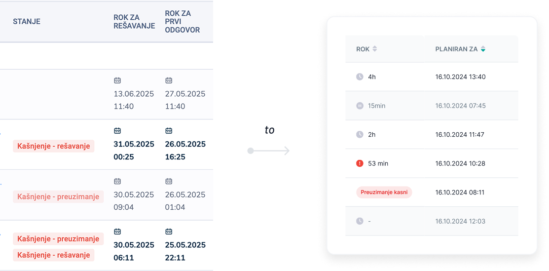
List after redesign
Ticket list filtering
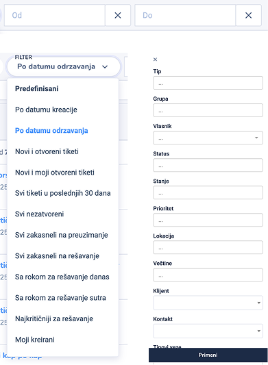
The original filtering experience was confusing because users couldn’t clearly see which filters were currently applied or how the ticket list was sorted - making navigation and task prioritization difficult.
There was an idea of using predefined filters, but these only added to the confusion. Users had no insight into what criteria those filters were based on, which made them hesitant to rely on them.
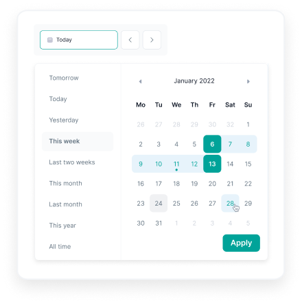
Filtering by date required users to manually input exact date ranges, which was inconvenient and error-prone — especially for common use cases like “today” or “this month.”
Identifying the most common filtering needs
Through conversations with users, I identified the filters they rely on most in their daily work — such as ticket status, assigned agent, and date ranges.
The goal was to reduce complexity for everyday tasks while still allowing enough flexibility for users to find exactly what they need.
Column-based filters & sort
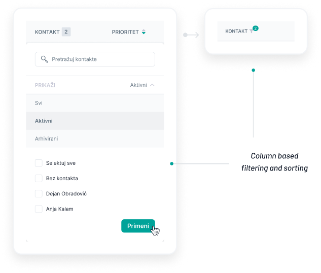
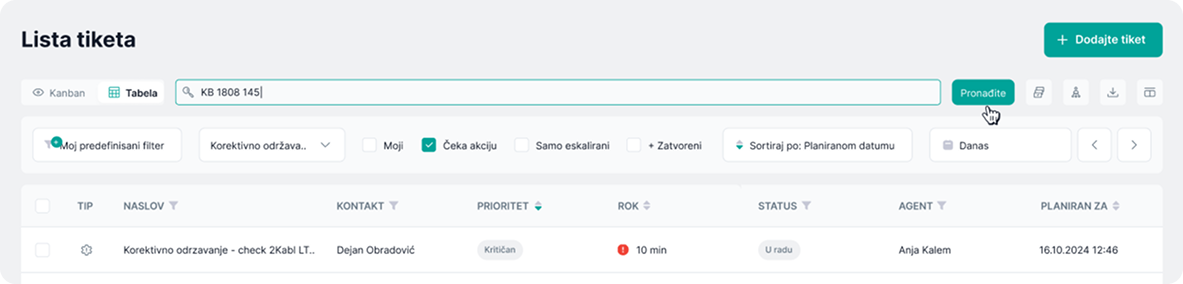
I introduced column-based filtering and sorting with clear visual indicators, so users can always see which parameter the list is filtered and sorted by.
Quick filters
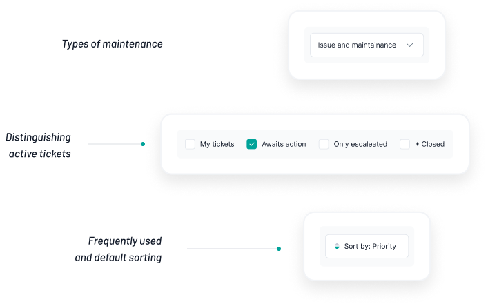
I added quick-access filters for the most frequently used criteria — such as ticket type, active status, date range and common sorting options.

Smart presets
The logic and interface for advanced filters were redesigned. Users who repeatedly filter tickets using the same criteria can now create and apply custom filter presets in just a couple of clicks, significantly speeding up their daily workflow.
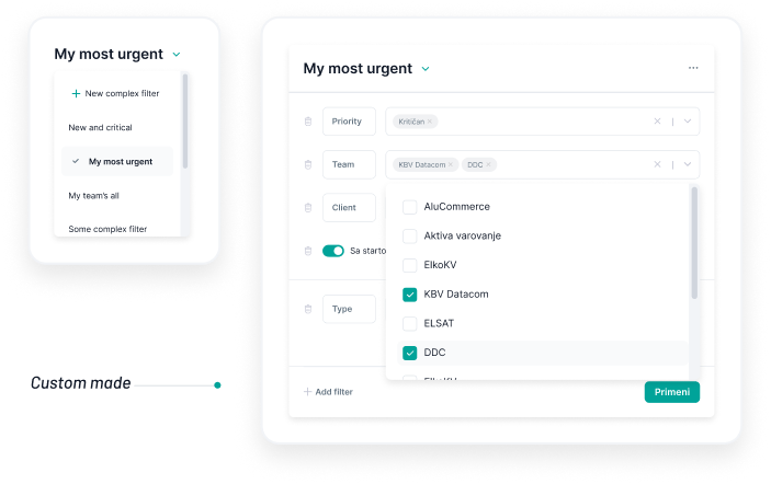
Filters now
Note: Filters (except quick ones) need to be applied manually to avoid unnecessary loading of large data sets.
Calendar didn’t show what’s planned, booked, or pending
Many types of equipment require regular maintenance regardless of breakdowns. Each item has its own frequency and maintenance checklist. Existing calendar view didn’t clearly show what was planned for when and what still
needed to be assigned, or what was already completed. This made it difficult for administrators and team leads to plan ahead or get a clear sense of what needs to be done each month.
Viewing the calendar as a planning tool for administrators
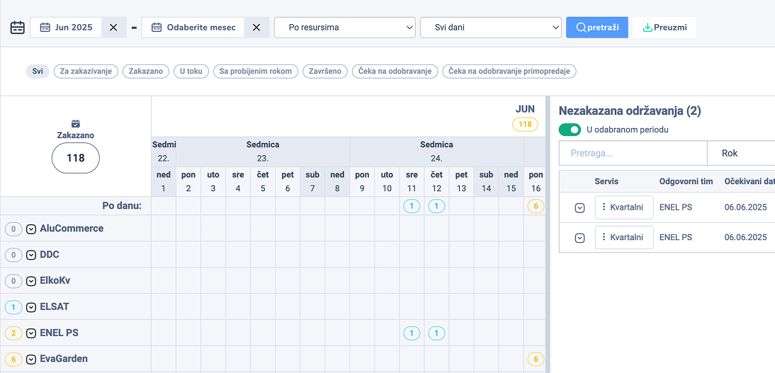
I redesigned the calendar to reflect real workload — which tasks are scheduled, which are assigned, and what is already done.
This gave teams a quick way to plan their month and spot gaps or avoid overload.
Visual indicators for smarter scheduling
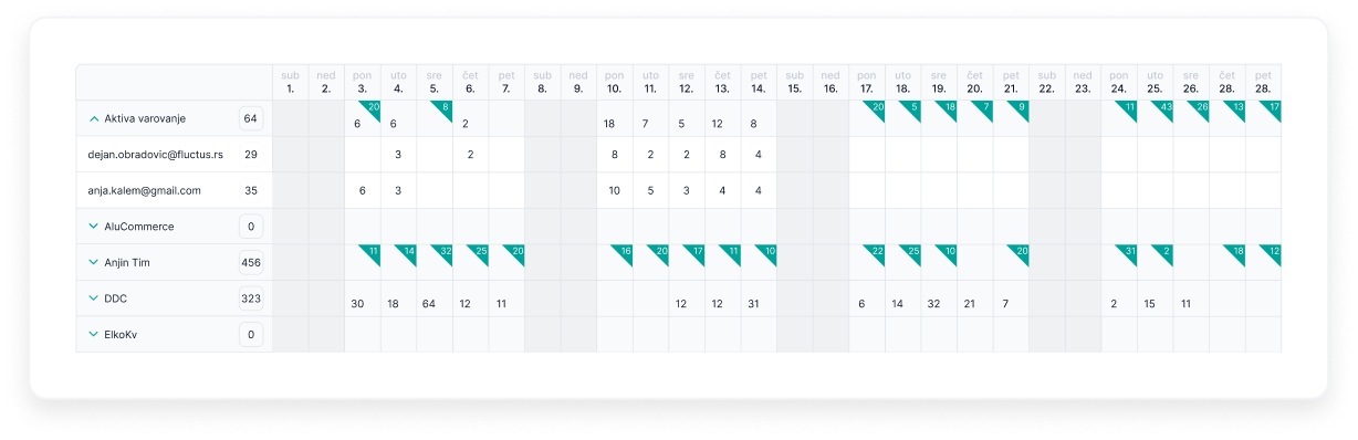
To help teams plan ahead we introduced simple visual cue - green triangle on days that include unassigned maintenance tasks.
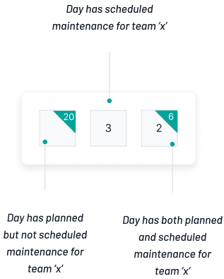
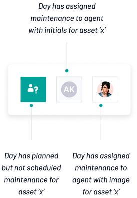
In the inventory-focused calendar view, indicators were added to show whether a maintenance task is planned for a specific item and day and whether it’s already assigned to an agent or still waiting for the assignment.
This visual structure helps teams stay organized and ensures that no maintenance task is overlooked.
Calendar
Easy to see real workload for day — and never miss scheduled but not assigned tasks.